
In yesterday’s New York Times, in an article on Martha and her company’s response to their own sluggish revenues, Martha helped unveil the redesigned Martha Stewart Living magazine. From the photograph that accompanied the article, and a quote attributed to the magazine’s editor in chief, Pilar Guzman, it would appear “the days of 1,000 word front-of-book stories are over.”
A photograph of the magazine’s cover (below) shows a heavy focus on cooking and recipes, which matches nicely the focus of Martha’s current television presence, now solely her “Martha Stewart’s Cooking School” on PBS, on which she demonstrates various cooking techniques.

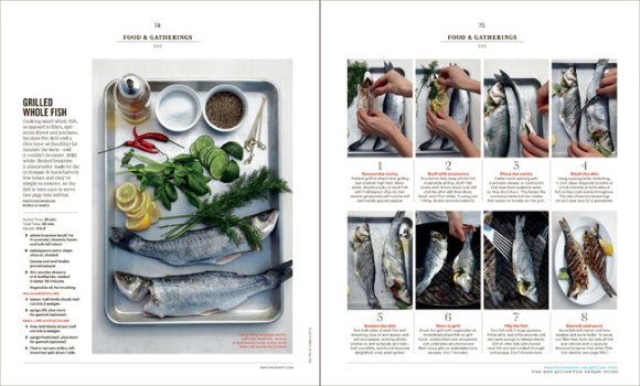
Hard to tell the extent of the changes from just these photographs, but it sure looks very “how-to”, doesn’t it? This step-by-step approach to presenting recipes is reminiscent of the content once found in the company’s “Everyday Food Magazine”, shuttered in late 2012. An absence of editorial, and a shift to cooking-only content, would also explain the recent departure of long-time design guru and legend, Gael Towey. (We FOMs miss you, Gael!)
FOMs: What do you think of the changes? To you, does this make Martha Stewart Living a more attractive magazine? Does this change the way you feel about Martha Stewart, the brand?
From the New York Times article:
“We understand that people are coming for short, consumable bites of information,” said Joseph Lagani, the company’s chief revenue officer. “People are not spending an hour with you. They’re there to get something.”
The redesign represents a large shift for Ms. Stewart, who built her reputation and her company largely on the strength of her cut-no-corners approach to cooking and crafts.
“I don’t want to retire,” Ms. Stewart said as she sat in a conference room framed by views of the Hudson River. “We’re trying to help figure it out. I don’t think it’s anything to run away from. I’m not banging my head against a stone wall here.”
In part, the redesign is an attempt to hang on to the magazine’s readers and artisans ages 18 to 34 who have become loyal fans. And like many publishers, the company is betting that video can help solve the online advertising riddle.
“That approach of putting cooking techniques near our recipes in video form has done really well,” Mr. Lagani said, “and many of our advertisers want to be part of that.”

As a long-time reader of Living, I was disappointed to see the July/August articles and columns in tiny, nearly unreadable font and organized in wide columns and massive paragraphs. To me it seemed as if the editors figured no one was going to read them anyway. Just because we love tiny phones, doesn’t mean we want to see tiny pictures and tiny print in our magazines!
I am hoping for the best.
Thanks for sharing your thoughts, Margie. Did you receive the September issue yet? (I’m a subscriber, so mine has already arrived in the mail.) I’m curious–what are your thoughts about the September issue? Do you still find the print to be too small? I’m fascinated by MSLO’s shift to a new design for Living, their flagship magazine. It’s such a tough time to be in any sort of publishing industry now–trying to remain afloat while everything is changing all around you must be quite a challenge! I noticed in the news today that Living editor, Pilar Guzman, was poached by another publication. In the past year, we have seen the departure of many higher-level MSLO executives.
While I don’t see much difference between the two issues, one improvement is on page 22, the From Martha column. Examples of the tiny print I object to are p. 29 and p 132. Looking at pages 36 and 144, I think more definition between sentences and paragraphs, using space and some bold type, would make the text more inviting to read. Thanks for asking!
Hello, Margie. I looked at those pages and you’re right–it is harder to read. I think the bold type closes up a bit at that size. For example, look at p 23. There, the type is the same size, but it is NOT bold. I think it is actually easier to read the non-bold type, than it is to read the bold type. Content-wise, I especially like the “Martha’s Weekend Arrangements” on p 113. I love Lily Pond Lane, Martha’s East Hampton home. It gets less exposure than either Bedford or Skylands, so it’s always nice to see photos of the place. (Of course, Turkey Hill will always have a special place in my heart, as that is where Martha began her rise to prominence.) Thank you for your comments here. They are very much appreciated.